Showing posts with label Art Stars. Show all posts

Tuesday, October 14, 2014

Art Star: TOMMA ABTS


BIOGRAPHY
Born: Kiel, Germany
Lives and Works: London

I love this quote...I put it quotes, but they aren't the exact words...this is basically what she said:
"In Europe, artists seem to be protected from the 'outside world'. In America, it's as if the 'outside world' is to be protected from artists."--not an exact quote...(also referring to government funding for the arts...blah blah blah)

WORK
(from the Tate Museum site)
Tomma Apts' paintings are the result of a rigorous working method that pitches the rational against the intuitive. She works consistently to a format of 48 x 38 cm in acrylic and oil paint. She uses no source material and begins with no preconceived idea of the final result. Instead, her paintings take shape through a gradual process of layering and accrual. As the internal logic of each composition unfolds forms are defined, buried and rediscovered until the painting becomes ‘congruent with itself’.

Abts describes the finished works as ‘a concentrate of the many paintings underneath’, each functioning as an autonomous object revealing the visible traces of its construction. Abts creates a complex interplay between the painting’s physical surface and the form that it describes. Planes that appear to be located in the foreground also remain embedded within the structure of the painting itself; shapes are both overlapping and integrated. Abstract elements might hover on the edge of representation but are then undermined by an incongruous perspective or colour scheme.

While each work develops within its own parameters, hung together in the gallery one is aware of formal and tonal relationships between canvases, reflecting the way Abts works on many at once, allowing ideas to migrate from one to another. Her titles are derived from a dictionary of first names and the process of naming marks the work’s completion.
Tomma Abts is nominated for her solo exhibitions at Kunsthalle Basel, Switzerland, and greengrassi, London, that revealed her rigorous and consistent approach to painting. Through her intimate and compelling canvases she builds on and enriches the language of abstract painting.

Video Interview: 


More Videos:


Paintings:


Thursday, October 9, 2014

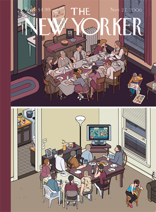
Art Star: CHRIS WARE


BIOGRAPHY


Chris Ware was born in 1967 in Omaha, Nebraska, where he was first inspired by reading Peanuts paperbacks in his grandmother’s basement, unlimited access to 1970s television. Ware got his start in published comics, however, while attending the University of Texas in Austin. He drew comics every week, and sometimes on a daily basis, for The Daily Texan, still the country's largest university newspaper. It was here that Ware began developing such characters as Quimby the Mouse and an early version of Jimmy Corrigan, the Smartest Kid on Earth. In 1987, Ware's work came to the attention of RAW editor Art Spiegelman (Maus), who invited him to contribute to the distinguished annual comics anthology.

In 1991 Ware moved to Chicago to pursue a Master’s degree in printmaking at the Art Institute of Chicago, which he did not complete, but the experience did instill in him a deep suspicion of all forms of theory and criticism about art and writing. While in his first year of school he was invited to draw a weekly strip for the alternative weekly New City in May 1992, in which he began the newer incarnation of his semi-autobiographical character, Jimmy Corrigan, and serialization of a story which would take seven years to complete. (from www.fantagraphics.com)


(Self Portrait)


QUOTES:

"It's uncanny that someone so young would have such an apparent recollection of the history of comics, and the talent to expand upon it." – Art Spiegelman


"Stupendous." – Matt Groening


"Ware’s work is among the very best graphic, comic, illustrative, and fine artwork being produced in the world right now." – Mother Jones


"With a meticulous intricacy, [Ware's] work draws the viewer into a world of sadness, whimsy, nostalgia for a past that might never have been and, sometimes, redemption. The experience of reading panel to panel has rarely been so emotional." – Los Angeles Times


INTERVIEW: The Guardian


Q: The structure of your pages and panels are often integral to the narrative. Do you plan the page after knowing the story, or do you tailor the story to fit with an idea for page layout?


A: I don't plan or write ahead of time, having found through painful trial and error than anything I did script ended up dead on arrival. Instead I try to allow the feedback loop of staring at a blank page with few distractions other than my own memories, disappointments and yearnings direct a story and set a tone. I start at the top or in the middle of the page and whatever happens, happens. I keep vague notes but fundamentally I believe it's very important for a story to find its own structure rather than the other way around — it's the central tenet of Louis Sullivan's architectural theory (his word, not mine) and I've found it to be true — really the only way to find the "shape of life" in an honest, awkward way that feels and hopefully is human. Our minds are already very organized things; the trick, I think, is simply to trust them.


On style and process:
I arrived at my way of "working" as a way of visually approximating what I feel the tone of fiction to be in prose versus the tone one might use to write biography; I would never do a biographical story using the deliberately synthetic way of cartooning I use to write fiction. I try to use the rules of typography to govern the way that I "draw", which keeps me at a sensible distance from the story as well as being a visual analog to the way we remember and conceptualize the world. I figured out this way of working by learning from and looking at artists I admired and whom I thought came closest to getting at what seemed to me to be the "essence" of comics, which is fundamentally the weird process of reading pictures, not just looking at them. I see the black outlines of cartoons as visual approximations of the way we remember general ideas, and I try to use naturalistic color underneath them to simultaneously suggest a perceptual experience, which I think is more or less the way we actually experience the world as adults; we don't really "see" anymore after a certain age, we spend our time naming and categorizing and identifying and figuring how everything all fits together. Unfortunately, as a result, I guess sometimes readers get a chilled or antiseptic sensation from it, which is certainly not intentional, and is something I admit as a failure, but is also something I can't completely change at the moment.


VIDEOS
Collaborations with Ira Glass--This American Life


"Yasujiro Ozu" by Chris Ware

Tokyo Story
In 2008 Cinefamily presented an ambitious retrospective of the films of Yasujiro Ozu, "one of the most revered of all Japanese directors."  They commissioned Chris Ware to illustrate the movie poster for Ozu's masterpiece, Tokyo Story.


Criterion Collection DVD Boxed Set:  The Only Son and There Was a Father


THE ONLY SON

Yasujiro Ozu’s first talkie, the uncommonly poignant The Only Son is among the Japanese director’s greatest works, a simple story about a good-natured mother who gives up everything to ensure her son’s education and future.


THERE WAS A FATHER

Yasujiro Ozu’s frequent leading man Chishu Ryu is riveting as Shuhei, a widowed high school teacher who finds that the more he tries to do what is best for his son’s future, the more they are separated.


Tuesday, October 7, 2014

Art Star: ANN HAMILTON


ANN HAMILTON
b. Lima, Ohio, in 1956
Lives and works in Ohio

EDUCATION
BFA in textile design from the University of Kansas in 1979
MFA in sculpture from the Yale School of Art in 1985


From 1985 to 1991, she taught on the faculty of the University of California at Santa Barbara. Hamilton has served on the faculty of The Ohio State University since 2001, where she is a Distinguished University Professor in the Department of Art.


Matterings


At the Central Library, you don’t even need to open a book to find all sorts of written text.  Ann Hamilton’s LEW Wood Floor (2004) is composed of sentences in 11 different languages, welcoming all visitors to the library. As a continuous tactile field, the wood floor consists of 556 lines of maple floorboard routed to make a walkable surface of relief letter forms. It  covers 7,200 square feet in the Evelyn W Foster Learning Center, at the 4th Avenue entrance, which is home to the Literacy/ESL/World Languages (LEW) Collection, from which the project derives its name. The artist chose languages that represent the largest and most frequently used areas of the LEW Collection: Arabic, Chinese, English, French, German, Italian, Japanese, Korean, Russian, Spanish and Vietnamese.
If you look closely, you will see that the letters are backwards . . . a reference to traditional typesetting technique in the days before digital printing. In addition, the task of reading the floorboards backwards “demonstrates the experience of learning to read as a process wherein abstract symbols become, in time, transparent and meaningful words and sentences.” The artist collected “1,543 first sentences gathered by patrons and librarians from books in The Seattle Public Library Fiction and LEW collection. Fiction and non-fiction, poetry and musical lyrics are the dominant textual sources. First lines may not be the most notable line of a book, but after the cover they are a universal portal to an immersion in a book’s interior world. The project seeks to evoke a tactile experience of book production and reading in this digital age.”


The installation tropos, like all of Ann Hamilton’s works, is a sensory experience. Created as a site-specific installation for Dia Center for the Arts in New York City, tropos refers to the idea of tropism, meaning a natural tendency, or a living being’s proclivity to respond to stimuli in a specific way, such as a plant that grows towards light.

The installation is made primarily from horse hair—a vast landscape of varying shades of hair from the tails of horses covers the entire floor of the 5,000-square foot space. Hamilton altered the floor beneath the hair with poured concrete, the effects of which are subtle shifts in the floor’s topography beneath the hair, which becomes clear only when a visitor walks across the room. Further on into the interior of the space, Hamilton has placed a small metal table, at which a seated attendant works diligently to burn the printed words from a book as smoke rises from the seared text. Muted, but audible, is a distant voice struggling to articulate words, which remain unintelligible for the most part. A final, subtle aspect of tropos is the sealed unity of the room, an effect created by Hamilton’s use of translucent glass in the windows; light beams in, yet sight to the outside is precluded. Like many of Hamilton’s large-scale works, tropos was created by hand through the collaborative efforts of many individuals, both at the FW+M and Dia Center for the Arts. The community that evolves from labor-intensive production is an important component of Hamilton’s methodology and artistic practice.

In 1994, after the completion of tropos, Hamilton created a second project with the FWM. A limited edition multiple encased in a glass and wood vitrine, her Untitled project is a collar fabricated from linen and horse hair. Strands of horse hair were used to embroider a 16th century-style alphabet on the inside of the collar. The unfinished ends of the embroidered hair pass through to the exterior of the collar, forming a swirling, circular mass of hair. The object recalls historic relics—an Elizabethan ruff, for example—yet remains connected to sensory experience through its assumed placement around a person’s throat with the letters of the alphabet resting near the voice box. Untitled references a relationship between the rapid growth of literacy and a gradual devaluation of non-verbal knowledge, such as that learned and experienced in the body.


Thursday, October 2, 2014

Art Star: VITO ACCONCI


BIOGRAPHY
Born: the Bronx, New York 1940.
Lives and works: Brooklyn, New York
Vito Acconci describes a career in which each new step meant rejecting the one before. He portrays himself as someone whose art developed out of a series of philosophical crises, a series of manifestos that he undermined over and over until he rejected art altogether and switched to architecture (of a sort). Now he’s busy wondering about the architecture.
Acconci’s design and architecture practice comes from a
background first in writing and then in art. He has always been
writing scripts – first in poetry and narrative, then in performance
scenarios and installation plotting, and now (through Acconci Studio)
in operational and algorithmic design. The Studio’s methods come from
computer-thinking, and mathematical and biological models; they treat
architecture as occasions for activity; they make spaces fluid,
changeable, portable. They recently completed a person-made twisting
island in Graz and a clothing store as soft as skin in Tokyo; they are
working now on a bulging restaurant in Milan and housing folded within
a terraced mountain in the south of France.


'RE:’ poem, 1960's


‘following piece’, 1969
courtesy acconci studio © vito acconci


‘following piece’ documents a performance, in the course of the action,
the artist followed different people in the street.
the action stopped suddenly, each time the person entered a private space.
with this simple gesture, acconci transcends the relativity of the learned
rules and behaviors concerning the distinction between private and public.
the act of following could last a few minutes, if the person then got into a car,
or four or five hours, if the person went to a cinema or restaurant.
acconci carried out this performance everyday for a month.
and he typed up an account of each 'pursuit', sending it each time to a different
member of the art community.
the concept was of the participation of persons who did not specifically agree
to participate. it relied on persons who did not even know that they were being used.

Excerpts from documentation:
Oct 14

5PM, 6th Ave & 4th St, SW corner: Man with black attache case -- he walks S on 6th Ave.

5:01PM: he goes down into IND subway station, 6th Ave & 3rd St, and stands on uptown side, upper platform.

5:08PM: he boards F train uptown.

5:50PM: he gets off at 169th St, Jamaica; he stands on line at bus stop, Hillside Ave & Homelawn St.

5:59PM: he boards 17A bus; line is too long and I’m too far behind him – I can’t get on.

Oct 23

2PM, Christopher St & Hudson, NE corner: Man in striped pants -- he walks S on Hudson St, E side of street.

2:04PM: he enters L & L Locksmith’s, 442 Hudson St; he goes behind counter and spends next few hours there.

6:12PM: he leaves store, locks it, and enters adjacent building.


Adaptation Studies (1. Blindfold Catching) 1970
Super 8 film, black and white, 3 min., silent

Fixed camera shoots me, full-body, standing blindfolded with my back to the wall: from off-screen, rubber balls are thrown at me, one at a time, over and over again.


Step Piece (Steps: Stepping-off Place) 1972
Artist's Statement: “An 18-inch stool is set up in my apartment and used as a step. Each morning, during the designated months, I step up and down the stool at the rate of 30 steps per minute. Each morning, the activity lasts as long as I can perform it without stopping…Announcements are sent to the public, who can see the activity performed, in my apartment, any time during the performance-months.”


‘where are we now (who are we anyway?),' 1976
by vito acconci © vito acconci


A plank that changes function: it starts by settling into
the room as a table, eight stools on either side - but it
doesn't stop there, it continues toward the window,
extends out the window and becomes a diving board.’


Convertible Clam Shelter 1990
fiberglass, galvanized steel, clamshells, audio and lights.


Two large clams that invite interaction. A softly-glowing built-in orb and relaxing music lull the weary visitor into a relaxed state, an interesting paradox for something (visiting an art museum) that's typically seen as a meditative act.


Adjustable Wall Bra, 1990-91.
Plaster, steel, canvas, light, lightbulbs, and audio equipment, Overall installation dimensions variable 13' 9" x 17' 4" x 13' 6" (424.1 x 530.8 x 416.5 cm), each cup 7' 3" x 7' 10 1/2" x 37" (221 x 240 x 94 cm). Sid R. Bass Fund and purchase. © 2009 Vito Acconci


"I want to put the viewer on shaky ground," Acconci has said, "so he has to reconsider himself and his circumstances." Adjustable Wall Bra prompts just this doubt. One possible reflexive response to it, sexual desire, is mocked by the work's size; another reduces us to infants dwarfed by their mother. Yet nothing says that the giantess implicit here is unfriendly. In fact the work is wittily accommodating.
Hinged in the center, the bra can be variously installed: both cups against the wall; one against the wall, one hanging outward, or on the wall adjoining; one cup on the wall, the other on the floor, or bridging wall and floor, or bulging from the ceiling. The cups are lined with canvas, and you can sit in them; and on the floor they suggest a tent or igloo. Its form invokes clothing, its scale evokes both furniture and architecture, and the work itself speaks of physical shelter. Even as its size disconcerts, its humor reassures: the cups light up, and built-in speakers broadcast steady breathing.


Instant House, 1980.
Flags, wood, springs, ropes, and pulleys, installation view.


'House of Cars #2' 1988


Mobile Linear City


Park up a Buiding


World in your Bones


United Bambo Store
Daikanyama, Tokyo, 2003

Steel mesh, steel pipe, faceted glass, PVC projection material, fluorescent lights, photo-booth camera, computer screen, video projection, i pods & headphones.


Detail of Roof Like a Liquid Flung over the Plaza, 2003
Canon Performing Arts Center, Memphis, TN
courtesy acconci studio © vito acconci


STUDIES


Drawing of Corner Plaza, 2001,
Canon Performing Arts Center, Memphis, TN
Courtesy acconci studio © vito acconci.


Maquette (model) for a park


‘Mur’ Island, 2003 Graz, Austria
Courtesy acconci studio © vito acconci.